This is about Top 100 ideal Employer Ranking of Engineering in 2014.
The Student Enrollment at the Purdue University in 2014 shows that the highest percentage of students enrolled in college of engineering (26%). So The Employer Ranking in Engineering will be very informative for the students at Purdue University.

When students find their house near the Purdue University, distance between campus and house is one of important factors. So after filtering information by users, showing houses on a visualized map will be useful source for students.

This is about the student enrollment at Purdue in fall, 2014.
This shows the number of enrolled students, undergraduate demographics, and undergraduate enrollment by Purdue College. From exploratory perspective, this will provide interesting insights to students at Purdue.

There are numerous teacher shortage areas in the US. This provides a good understanding the nation where states and schools are looking to potentially hire academic administrators, licensed teachers, and other educators.

This is about the history of airplane crashes and fatalities Since 1908.
Among all the traffic accidents, the fatal rate of airplane crashes is the highest. This provide information how time, location and airplane type influence airplane crashes since 1908.

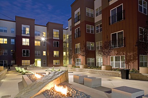
This is about a real estate and homes for sale in West Lafayette.
People spend lots of time looking for real estate comparing prices and locations. This provides an understanding the prices and facilities difference in terms of locations in West Lafayette.

This is about restaurants and customer preference from yelp dataset.
We are curious about what are the difference of customer preference and how they choose and review restaurant in different areas in US. This study benefit customers choosing better restaurants and cooks change their menu that meets customers' prefernce.

The BLS collects all manner of data on epmloyment numbers across the US. While not necessarily exciting, some compelling and immediately relevant visualizations of this data can certainly be built to make sense of the sea of numbers that surround Americans regarding employment.

This site is intended to give an idea of what a location in the US is like to live in.
The current layout of the "Best Places" site is designed for research on particular locations, but little else. What trends will come up when the data is better visualized on a nationwide scale?

The US government likes it's bureaucracy, and produces huge quantities of data that relate directly or indirectly to everyone living in the US. Like the employment numbers, it is relevant but not exciting.

TA Purdue education is very expensive. Where does all that money go? Do we agree with how it is being spent? A well-put-together visualization of how Purdue manages what used to be our money could inform these questions.